UnitedHealthcare · Product design · 2025
A claim could be denied in one to two days, regardless of medical need.Now it takes a second person to make that final.
Two of UnitedHealthcare’s algorithms decide fast: one denies a claim, one clears a bill, and neither has to prove itself first. I designed the internal layer that makes both stop, get reviewed by a person told why before they decide, and leave a record that survives a mistake. An 8.5-month Florida pilot, proposed by a team of three.
UnitedHealthcare
How might we prove a claim was falsely denied, or a bill involved fraudulent billing or a ghost claim, before either decision becomes final?
Lead product and systems designer. I designed the internal review system: the queue, the reveal, and the record, run the same way on a denial and on a bill.
I added human oversight before the decision could become final: the screen shows why the algorithm flagged it, and the reviewer decides from there. It runs the same way whether the algorithm denied a claim or flagged a bill.
Eight screens proving one mechanic twice: a queue, a review that shows why before it decides, and a record nothing can quietly edit. Modeled, not measured, on an 8.5-month pilot.
Making AI decisions legible is not the same as making them accountable.
The design thesis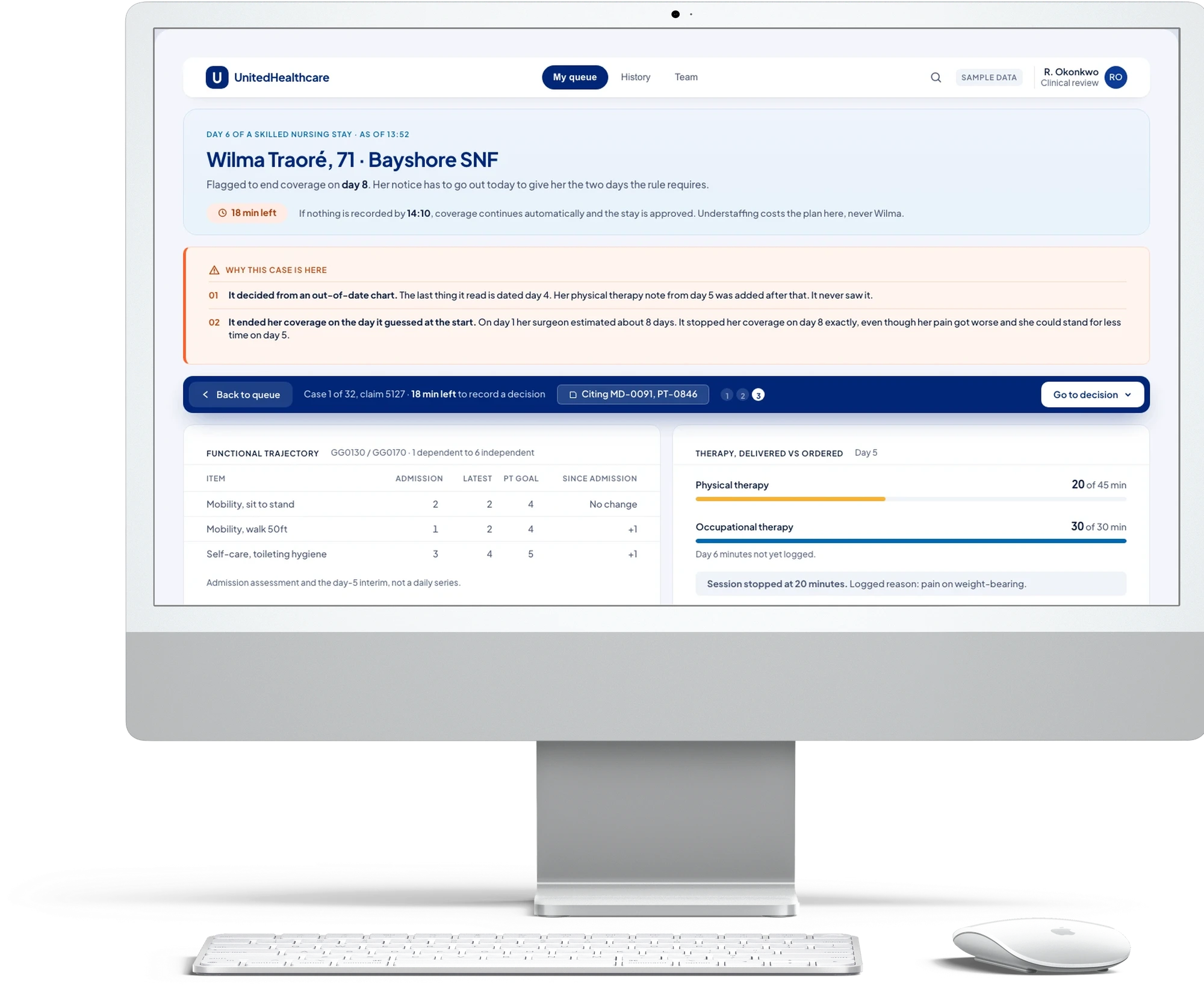
The care was already given. The plan had thirty days to decide and used one.
How might we prove a claim was falsely denied, or a bill involved fraudulent billing, like a ghost claim, before either decision becomes final?
An AI model auto-denied rehab claims after one to two days, regardless of medical need, and 72% of seniors cannot fully understand the letter that tries to explain it anyway. Nothing about either decision was ever written down. So the member cannot contest what they cannot read, and six months later an auditor opens the file and finds it empty.
Better wording will not fix that, and neither will a more accurate model. A score cannot be a denial. The reason has to be captured at the moment the decision is made, by a person who can be named, or it does not exist at all.
For office visits the provider could not show ever happened
Source · The claim followed through this page
Duplicate charges, upcoding and ghost claims, caught after payment
Source · Market analysis, UHC proposal
For a denial or a hold, from either algorithm
Source · The proposal itself
Market research, conversations in the space, and the regulation itself. Each one changed a decision.
A family was billed more than $11,000 for a short emergency visit, with an explanation of benefits nobody could read and almost no help appealing it (The New Yorker, 2024). Separately, duplicate charges, upcoding and ghost claims went uncaught until they were audited after the fact (UHC proposal, market analysis).
Industry-wide, 18% of claims are denied with no clear explanation attached (KFF, 2023), and 64% of seniors would prefer an AI-assisted explanation, if anyone offered them one (polling, UHC proposal).
Three findings each moved a screen. The CMS windows are fixed, so the review still gates itself behind three real acts rather than a clock the reviewer could outrun: a decision, a finding in their own words, a cited passage (Decision 01). A denial is an organization determination, not a status change, so its record can be added to, never overwritten (Decision 02). And a duplicate charge or ghost claim is still invisible from inside one chart at a time, which is why a pattern gets its own console (Decision 03).
the thing i keep circling: i can make a denial legible, auditable, contestable. an insurer whose margin depends on denials can run all of it and deny the same claim anyway, now with a clean trail. auditable is not the same as fair.
Auditable is not the same as fair, and a research finding is not a screen. What follows is what I built so that fixing one did not mean giving up on the other.
An internal oversight product, and an AI chat interface already inside the app.
Two products, one data layer. Not two apps.
One gives compliance a human check before an AI-flagged denial, a fraud bill, or a ghost claim becomes final. The other is an AI chat interface built into the UHC app members already have. Both read the same claim, 5127, so what a member is told never drifts from what an auditor later opens.
The proposal never named who a screen was actually for. Which reader it is written for is the whole design question.
The SIU analyst
Fifty-two open claims and a thirty day clock on each. Sees the score and the signals behind it, but not whether the provider will still bill the member directly.
Written forEvery screen in the internal product.
The member
Did nothing wrong, and has no idea a decision is being made until one letter arrives after the fact.
Written forOne screen, and it is the only artifact that leaves the building.
The compliance auditor
Opens the record six months on, one of forty in a sample, and can see only what it kept, including whatever the analyst was allowed to leave out.
Written forThe record screen, which refuses to commit without it.
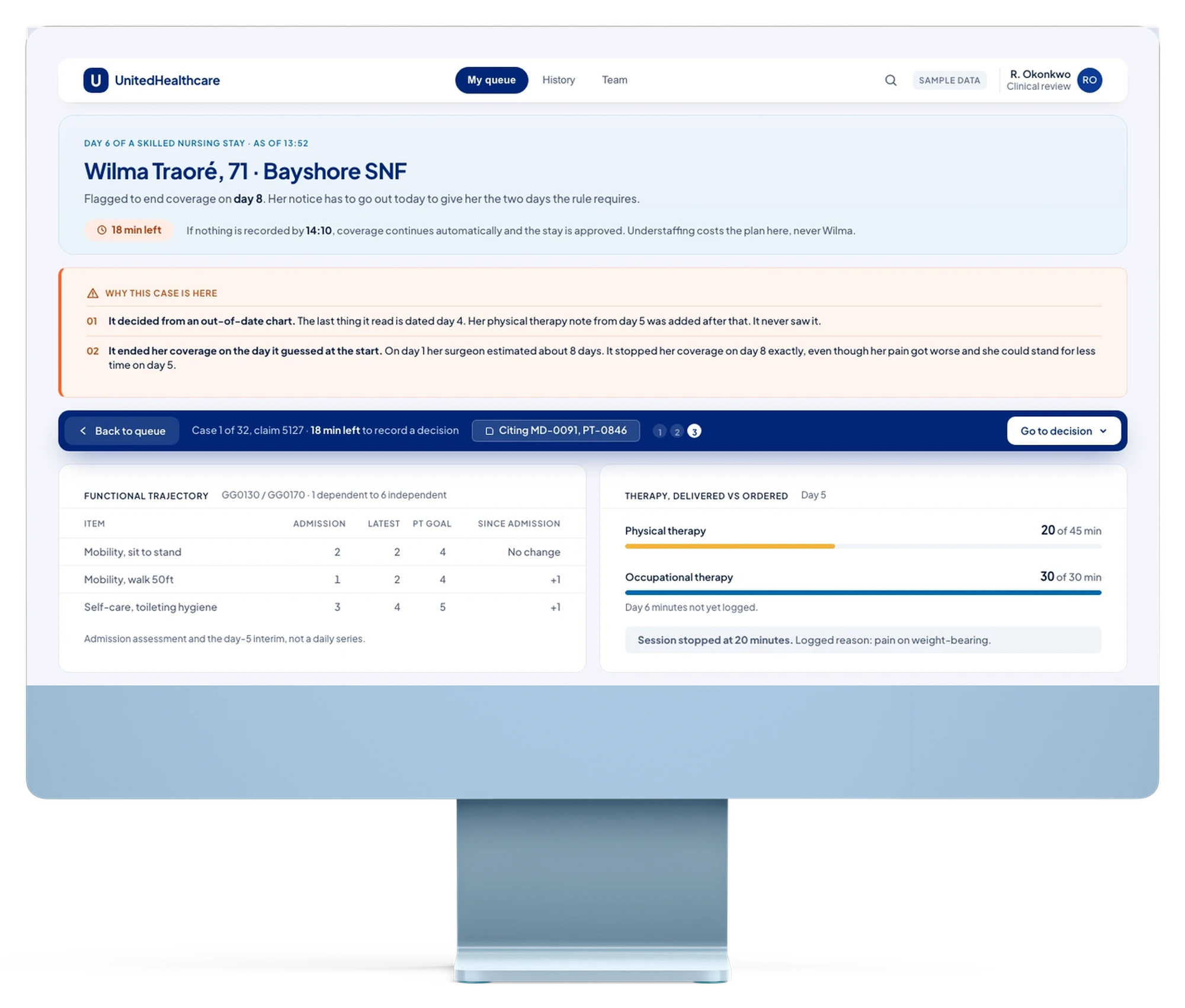
Where the determination gets made: the flagged claim, the evidence, the finding typed, the passage cited. Dense and keyboard-driven, for someone carrying fifty-two open claims a day, denials and fraud flags worked from the same queue.
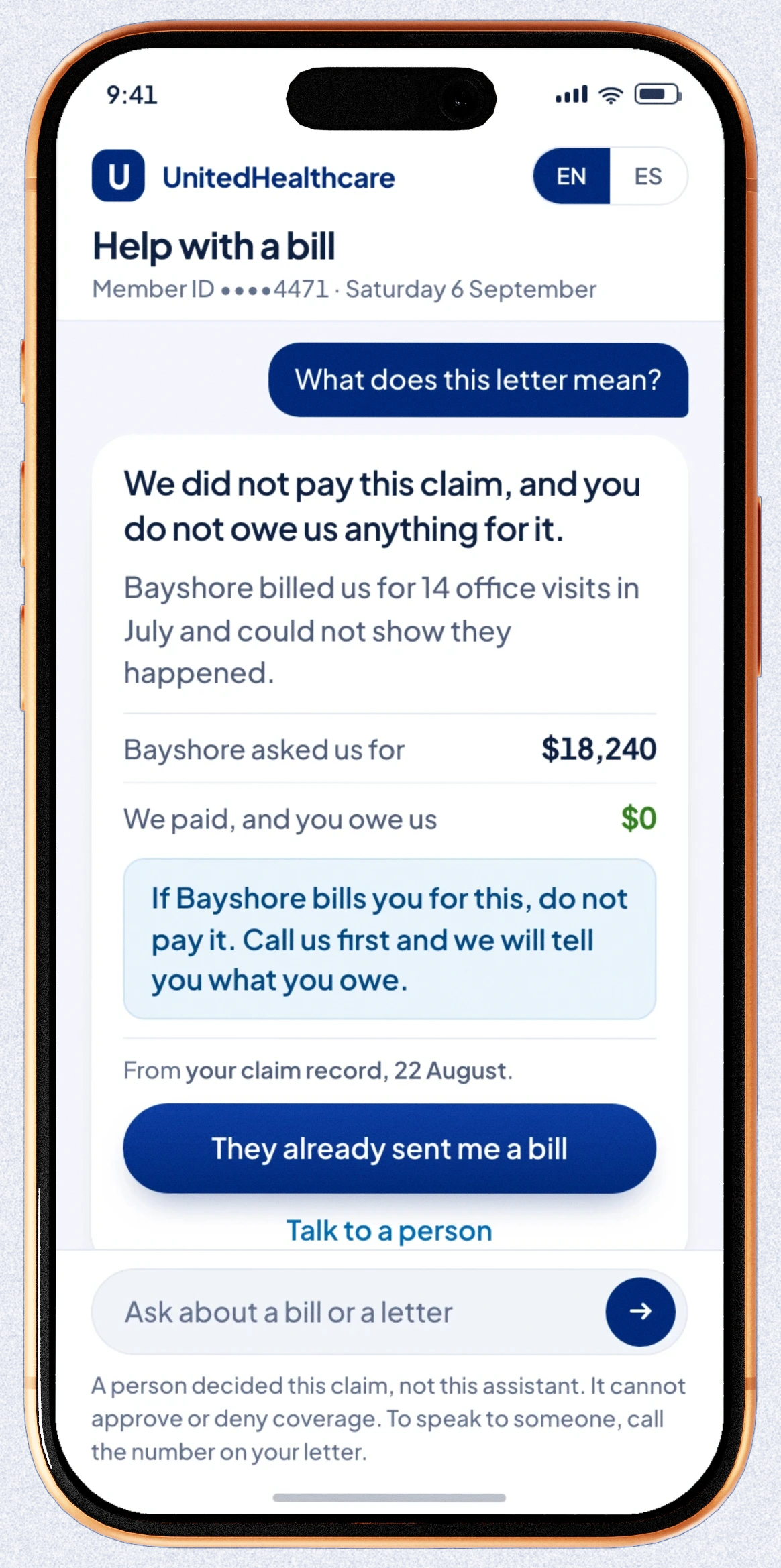
Where it gets explained: what happened, what is owed, and the one thing left to do, in plain language, inside the app the member already has. It is the direct answer to the 72% of seniors who said they could not understand the letter on its own.
The full site map, by roleFig 2.1 · expand
Six roles, six separate journey mapsFig 2.2 · expand
The chat interface is explained in full later, in the member’s hand. This is what the internal product actually refuses to let a reviewer do.
What the product refuses to allow, and what each refusal cost.
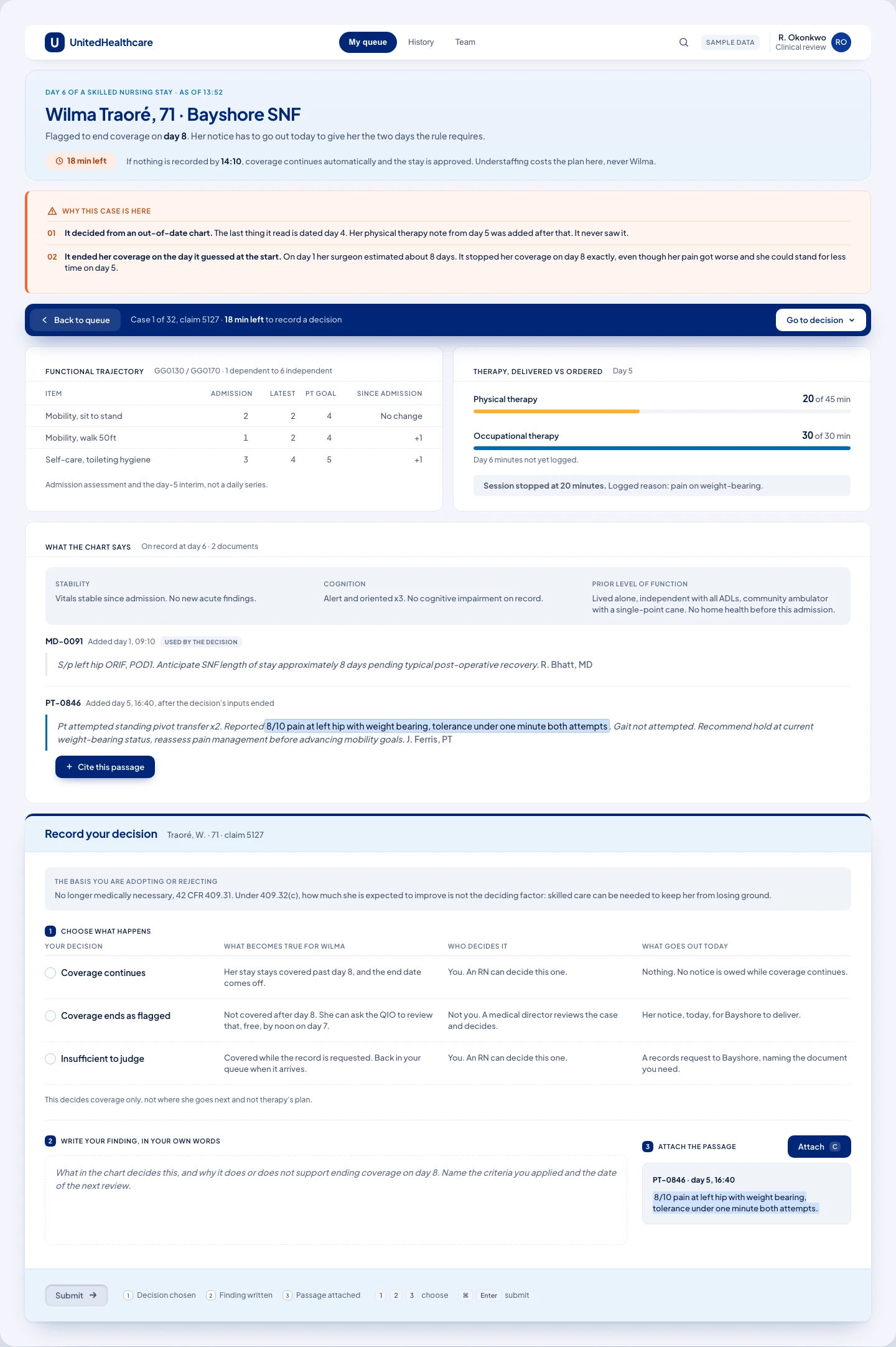
This is the internal product from the proposed solution, not the member chat interface: the screens the compliance team works from. A reviewer opens a flagged case from a queue of fifty-two, reads the evidence, writes a finding in their own words, and cites the passage behind it before they can submit a determination, which becomes a permanent record. A second, separate console watches the pattern across every case like it, since no single reviewer ever sees more than one chart at a time.
One option card had more to explain than the other two, so it looked like the recommended choice.
One table, not three cards
Shows the three outcomes as three rows in one table, so all three take up exactly the same space. Keeps submit locked until the reviewer has picked the actual rule from the regulation's own text, typed a finding in their own words, and cited the exact passage they used.
Suggest which outcome is right, rank the three options, or let a reviewer submit by agreeing with a score or picking from a dropdown.
The first version showed three option cards. One needed more explaining, so its card was bigger, and it looked recommended even though nothing was supposed to be. A blind panel of five reviewers independently converged on the same fix.
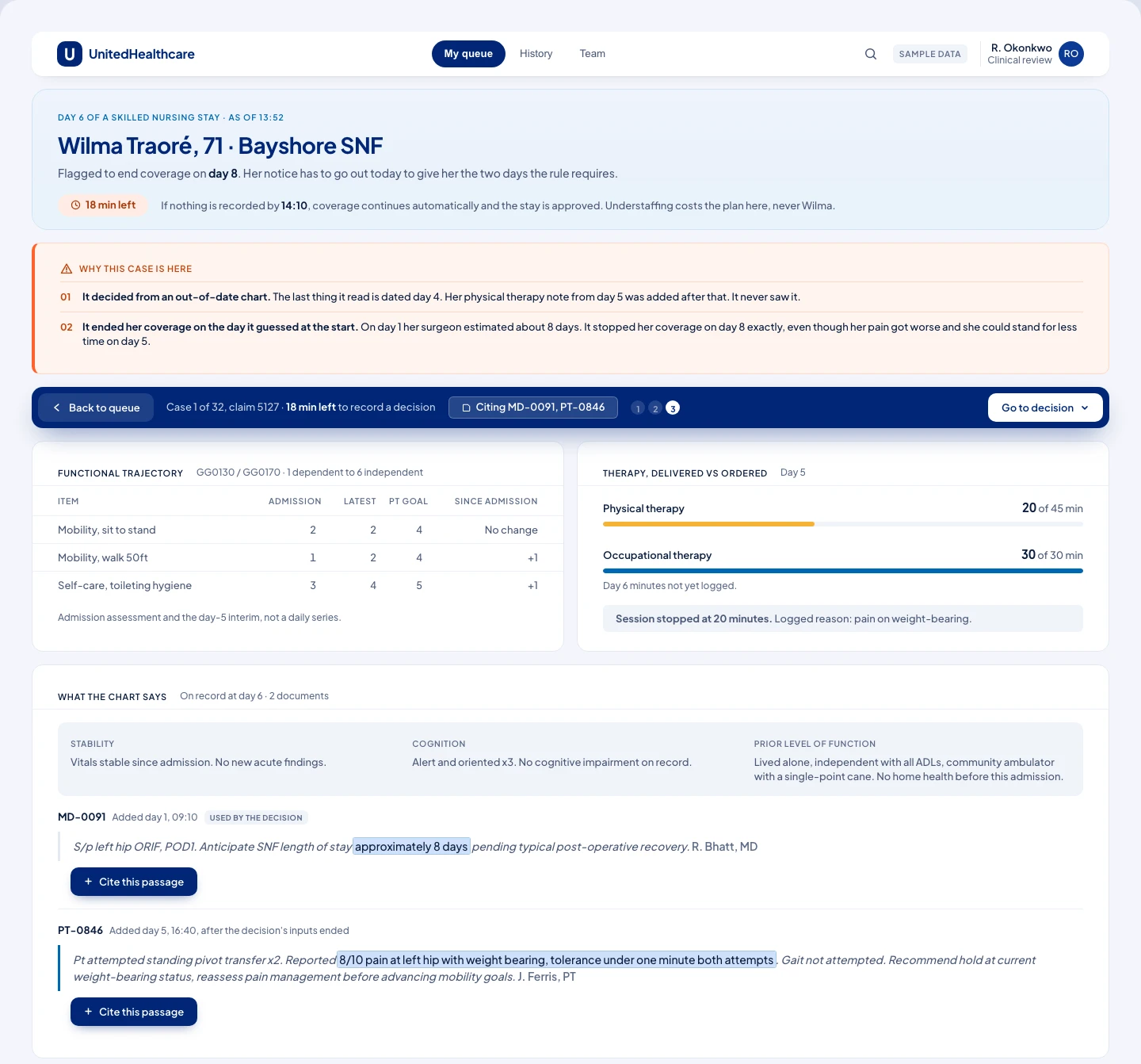
The top half of the screen. Two signals surface before the chart opens, and a citation has to come from selecting inside either source document.
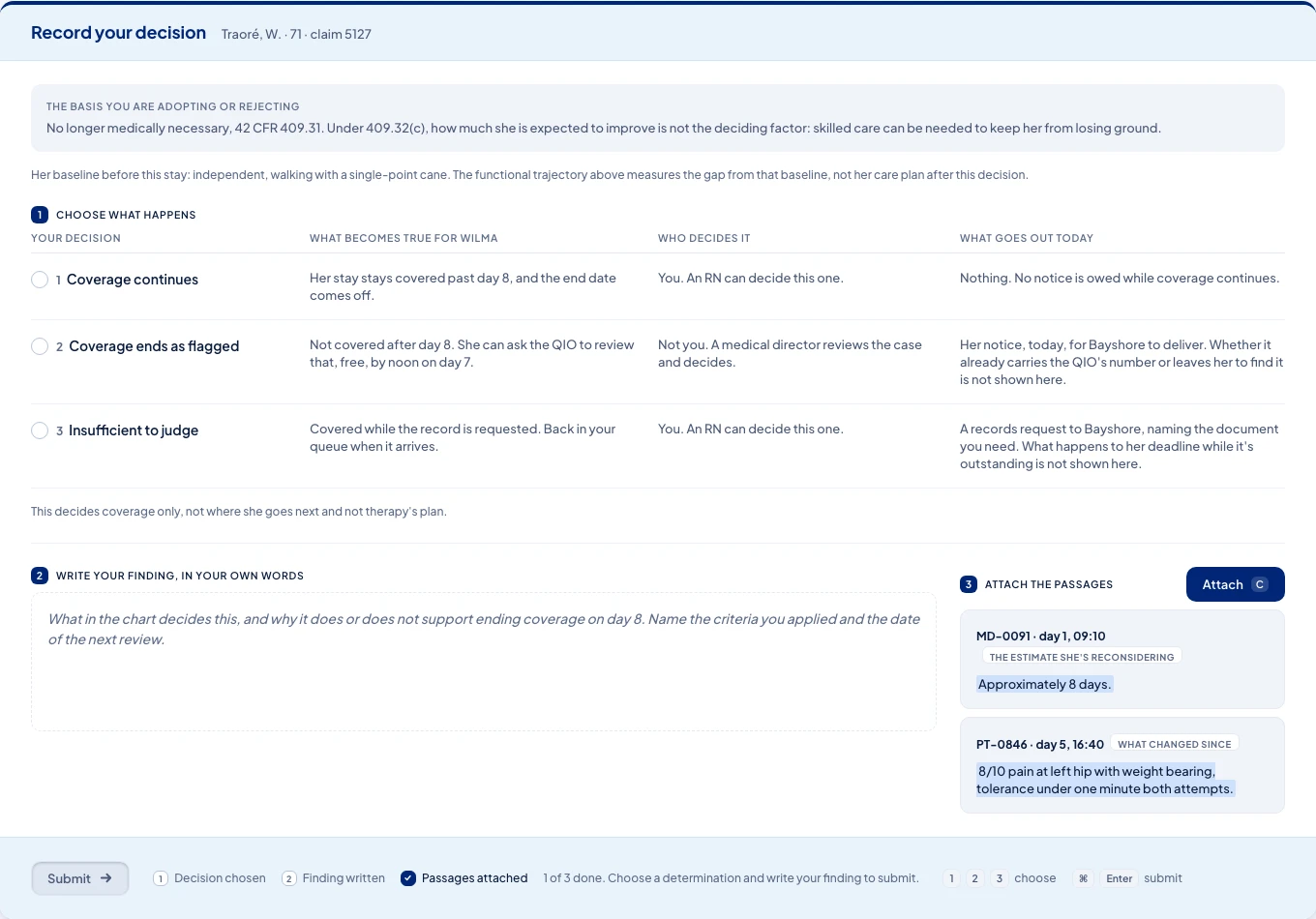
Record your decision: the table, the typed finding, and the attached passage, behind a submit that stays locked until all three exist.
This is the human override, not a rubber stamp
Keeps submit locked until the reviewer picks one of three outcomes, writes a finding in their own words, and attaches the passage behind it. This is the actual override: their choice becomes the record, not the model's flag.
Let the reviewer submit by agreeing with the score alone, or record a decision with no written reason or citation attached to it.
The screen forces an independent decision, not a confirmation. The model's flag started the case, but the reviewer's own comparison, finding, and citation are what get recorded, and what a regulator can later audit.
The reviewer's own written reason was the third thing on the screen, in a box that looked disabled.
The reviewer's words lead, the flag is a footnote
Puts the reviewer's own written finding first and biggest on the permanent record, with the passage they cited hanging directly off it.
Give the two automatic flagging signals the same visual weight as the reviewer's own reasoning, or let anyone silently edit the record once it is committed.
The first version showed the outcome badge, the reviewer's finding, the citation, and the two signals all at the same size. Their own finding sat third, in a box that looked like a disabled form field. Reordered so their words lead; the record can be amended before the deadline or routed to calibration, never overwritten.
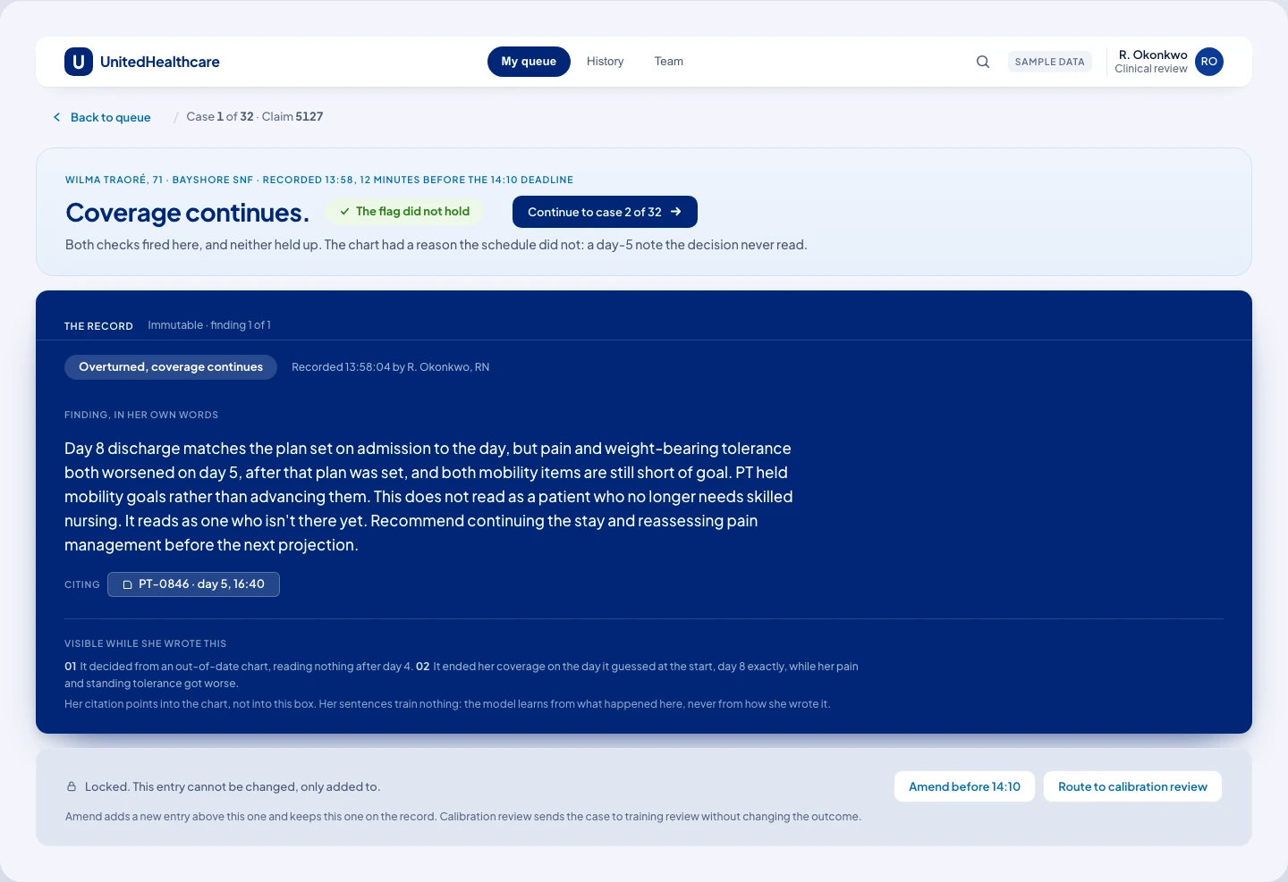
The committed card: the reviewer's finding first and unbordered, the flag that started the case reduced to a footnote beneath it.
A reviewer can be right about one chart and never see the pattern.
One console watches the rate, not the case
Tracks the denial rate across an entire category of care, and tests it against a blind sample of claims that were already paid before anyone reviewed them.
Rely on any single reviewer noticing the pattern, or confirm a problem off the sample's best-case reading.
A reviewer only ever opens one chart, so nothing on the per-case screens could show that 1,943 other denials shared the same basis text. Home health denials broke their band, 13.4% against a 9.1% ceiling. Sixty of those claims were paid up front and reviewed blind; the design confirms only once the worst-case reading of that sample still clears the threshold, not the average.
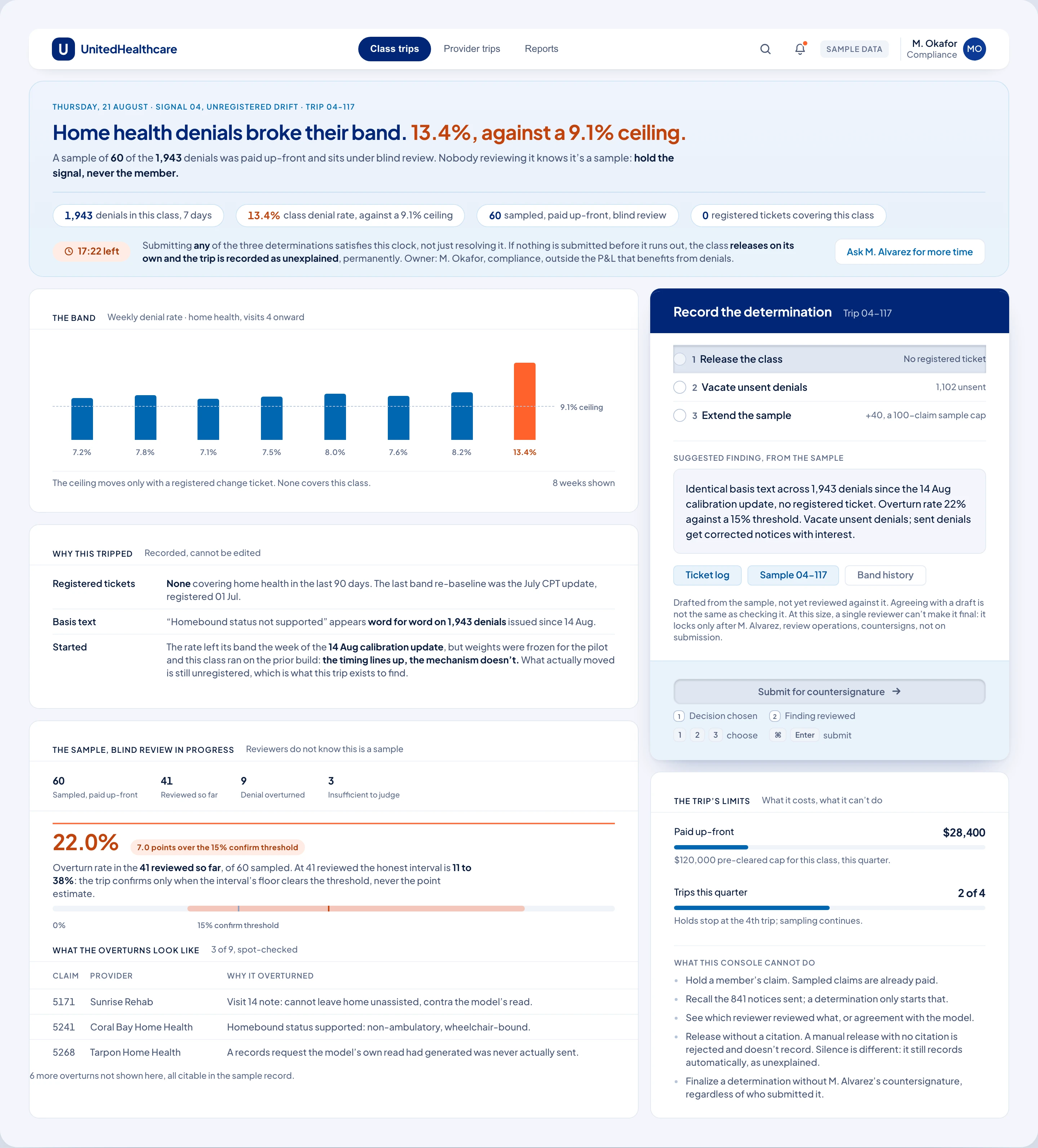
The class trip: a denial rate breaking its band, a blind sample already paid, and a determination that only confirms once the honest interval clears the threshold.
Three refusals, each one written after something specific went wrong. A rule is only a rule if a screen refuses to let you past it. This is what they look like at the desk.
The same claim, written for the person it happens to.
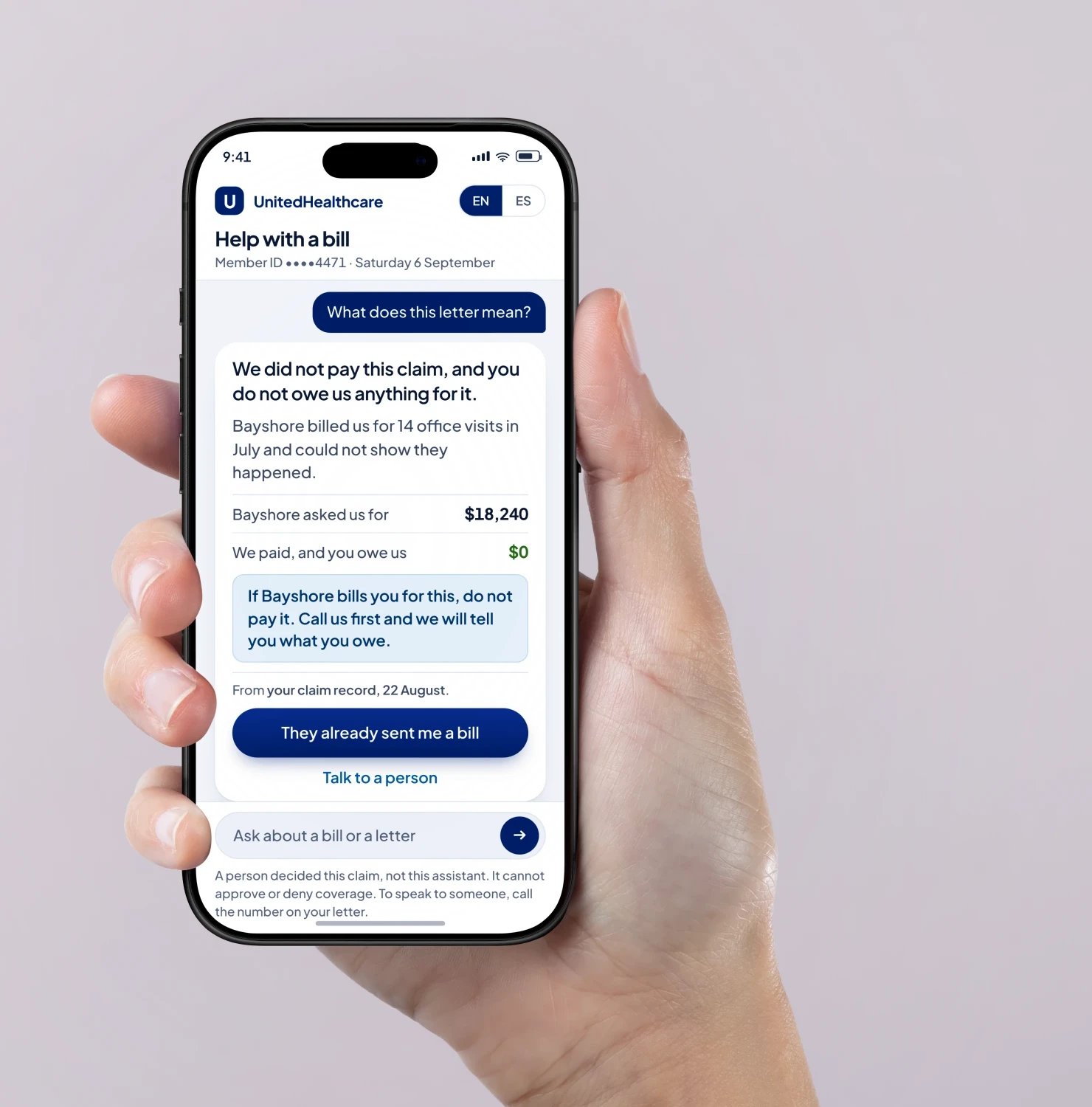 The same assistant, the day it is actually held in a hand.
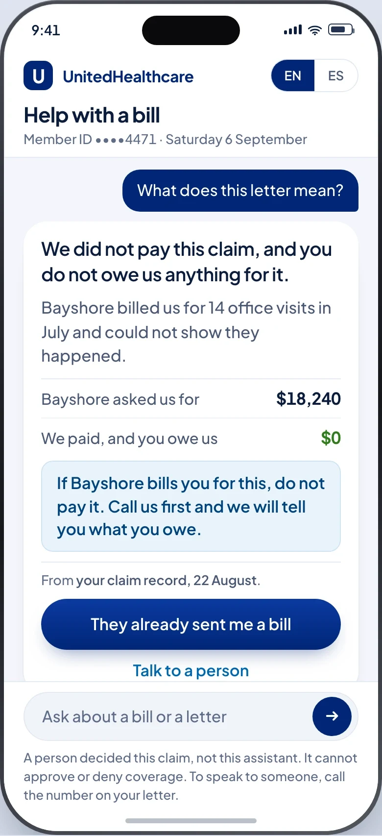
The letter the member could not read, answered so they can.
The letter that started this is the one 72% of seniors said they could not fully understand. This answer is measured at a Flesch-Kincaid grade of 4.7, states the decision and the money before anything else, and says outright what it is not allowed to decide.
It is also the only surface in the system that ever sees the bill the provider sent. The compliance screen says in its own words that balance billing is not visible to it, so the member is the one person who can supply that half of the record.
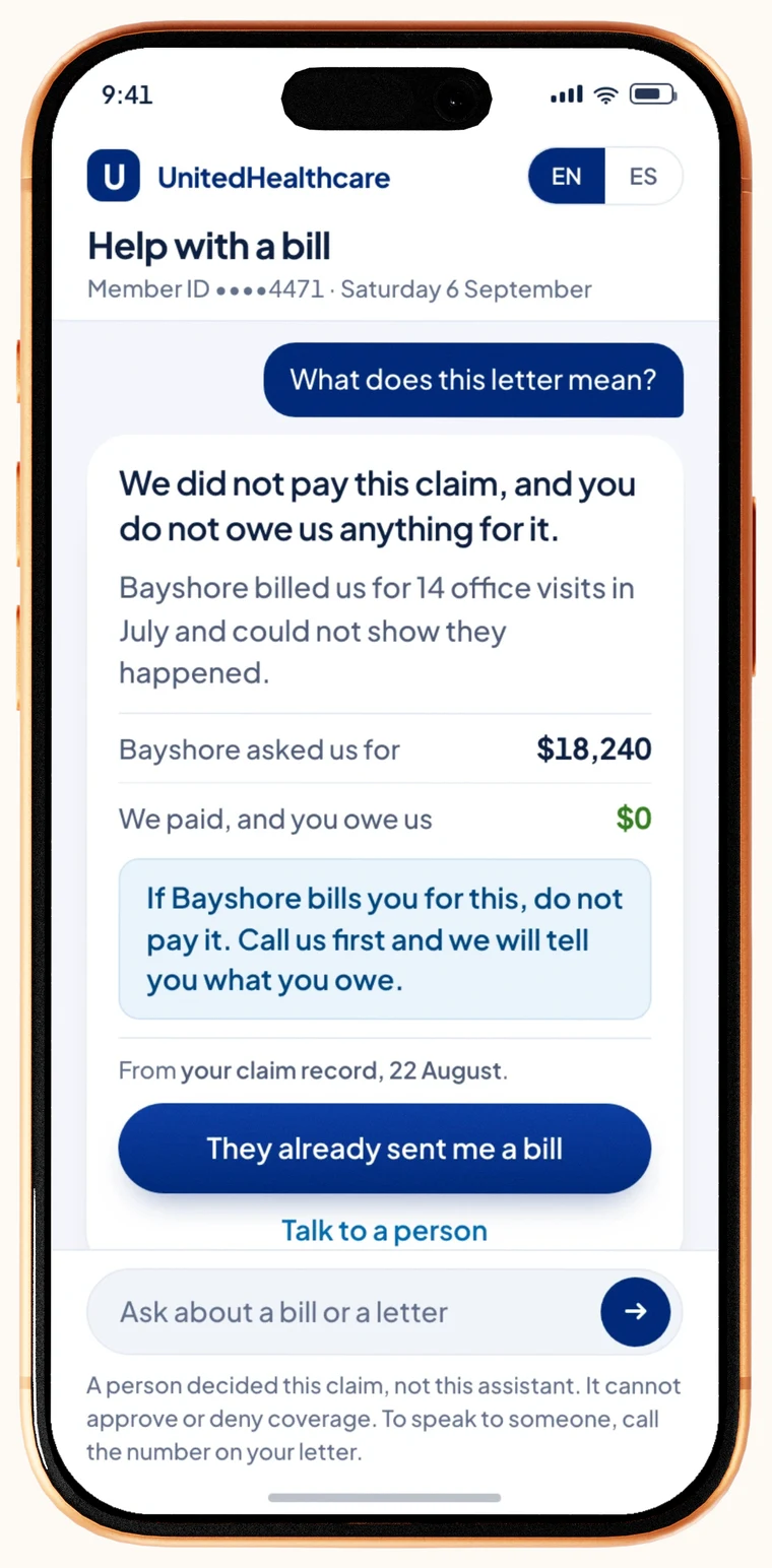
What the letter meant
States the decision, the money, and the one thing to do, in that order, cited to the record it came from.
Let the assistant approve or deny anything, or leave the reader guessing who actually decided.
The letter that started this is the one 72% of seniors said they could not understand. The footer says plainly that a person decided the claim, not the assistant.
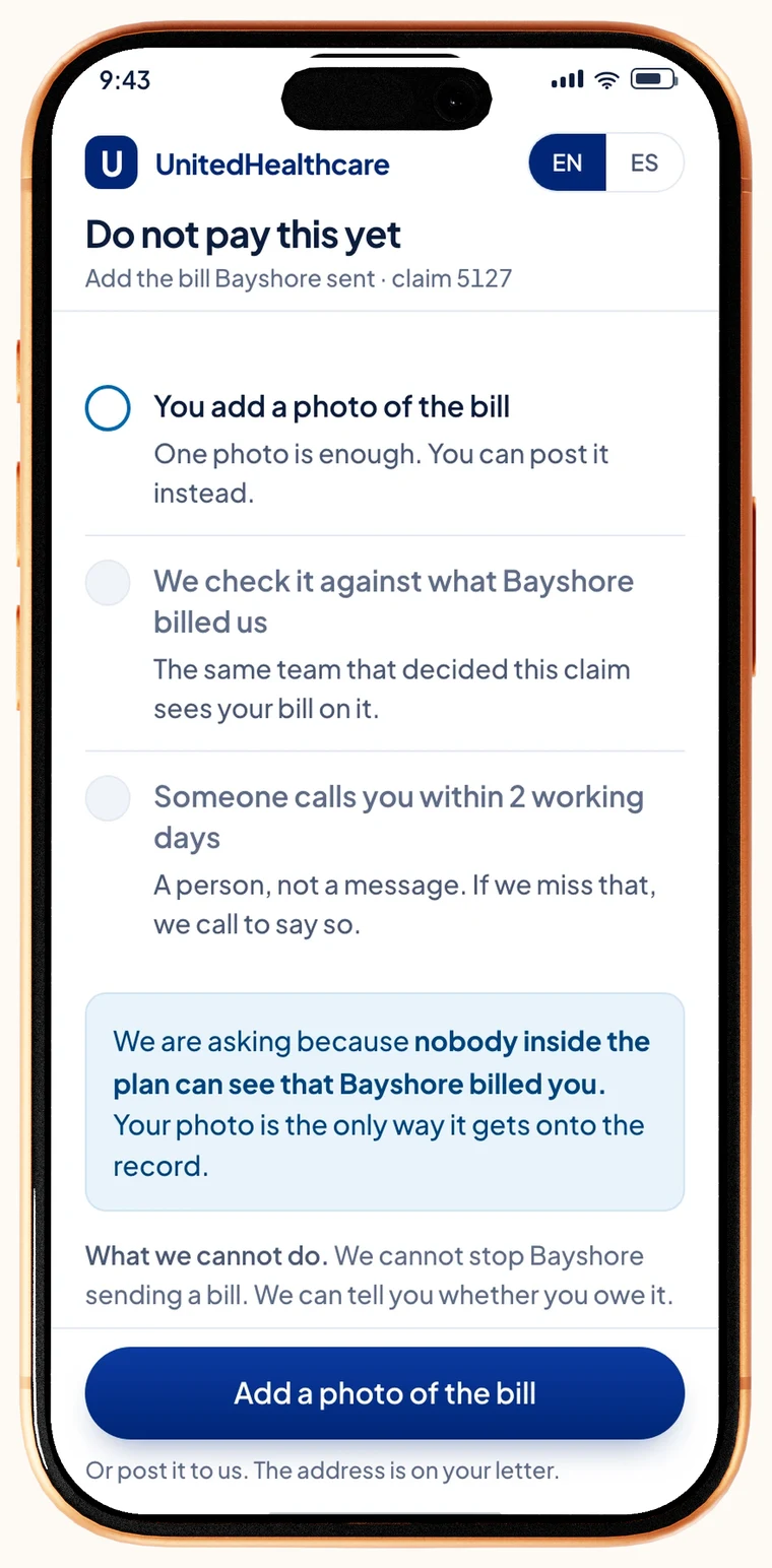
Reporting the bill
Turns a reported bill into a task: a checked-by step and a date, with a photo attached.
Treat it as a chat message, or let the plan see a bill that nobody inside it can otherwise see.
Balance billing happens entirely outside the claim system, so adding evidence is work, not a conversation. This is the only place the provider’s bill ever enters the system at all.
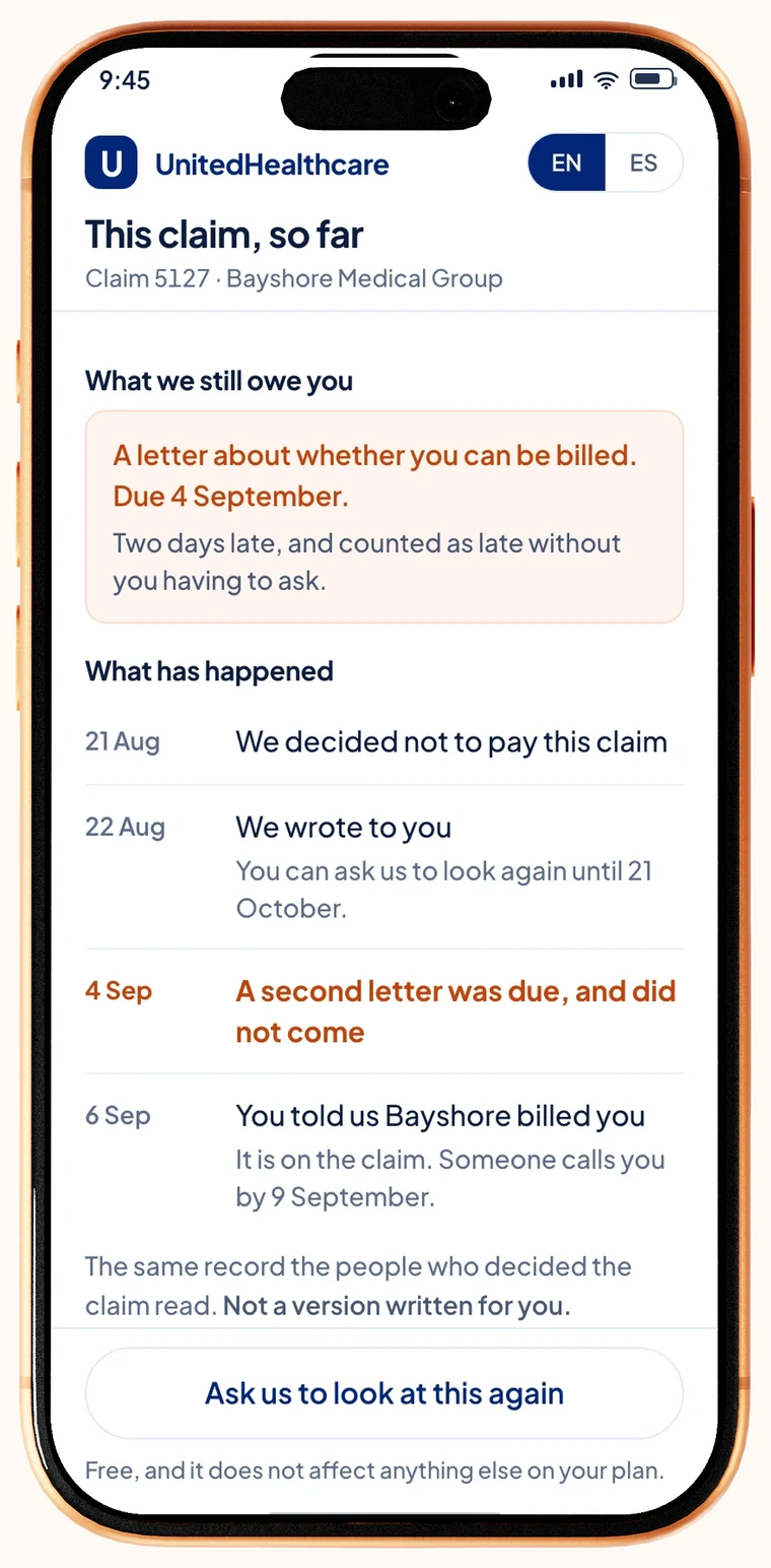
What we owe you
Shows the overdue item on the day it goes late, to the person actually waiting on it.
Wait for a compliance auditor to find the same gap six months later, or make the member ask.
The audit trail, turned around. What a compliance auditor eventually finds in a sample is shown first to the person it happened to.
That is the claim when the flag was right. Here is what the product has to do when the flag is not.
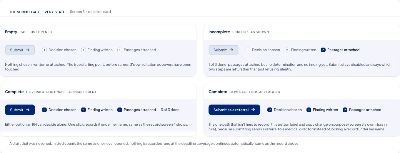
No one opened this claim. The deadline decided it instead.
Nobody decided, and the clock did not care
Claim 5163 sat behind cases that came due first, and Rita never opened it before 19:30. Coverage continues automatically at the deadline either way, so the record says plainly that no one decided it and routes the case to calibration instead of quietly reopening it as if a person had.
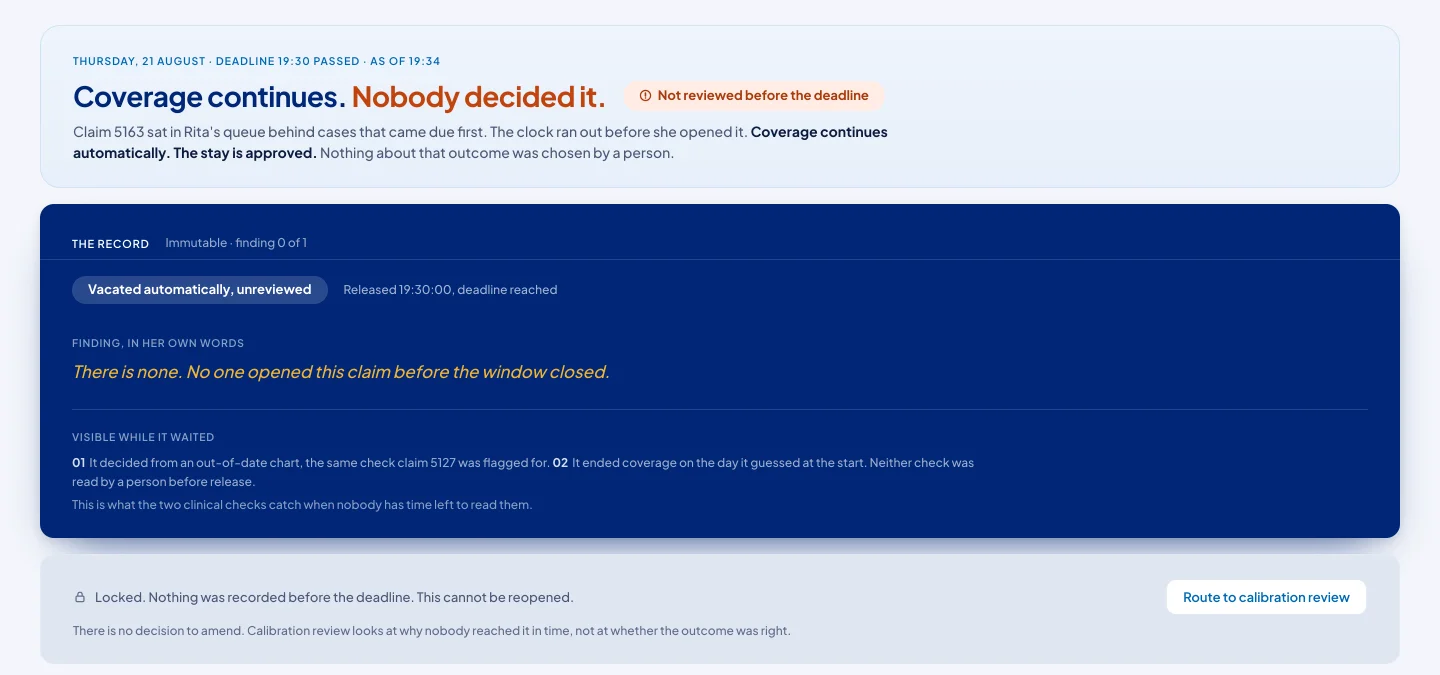
Coverage cannot be left undecided at a deadline. Something has to happen, and the only default that does not remove care is to let it continue.
Letting the record read as if a reviewer had approved it. That would hide the actual failure - an unopened queue - behind an outcome that looks identical to a real one.
The same submit gate that blocks an incomplete finding on the record-your-decision card is why a claim nobody opened resolves the same way as a draft nobody sent: nothing recorded, coverage continues, and the open question is why the queue missed it, not whether the outcome was right.
The record-your-decision card from earlier, in every state it can be in. The same three checks that hold an incomplete finding are what a missed deadline falls back on when no one reaches the case at all.
Nothing here was tested on a real user. What the pilot is designed to hit.
A decision the plan can defend, and a member can actually answer.
This is a pilot proposal, so nothing below was tested on a real user. Each number is a projected target rather than a measurement, and each is tied to one specific decision on this page rather than floating on its own.
Product-level, not contractual or financial. Each is tied to one specific decision rather than floating on its own.
Did accountability shift, or only the interface?
CMS reporting accuracy
Any error recreates the exposure. This is the line that cannot move.
The business case: three platform decisions, the adoption model, the planAppendix · expand
30 days to determine, 60 days to appeal
The determination window runs from the day the claim arrives, not the day an analyst opens it. The notice that follows starts the member’s appeal clock on its own date.
What it didSets the ordering rule in the queue, and the date arithmetic on the notice.
The notice is a legally operative document
It stops the payment, states what the member owes, and opens the appeal. CMS notice-content rules govern what it has to say, so it cannot be edited freely and cannot claim more than the record holds.
What it didKills the free-text edit on the notice screen. Forces the exposure checks.
Dual-eligible members are protected from balance billing
A QMB member cannot be billed for the balance. The plan has to confirm that status before it can assert it, and on this claim it had not.
What it didThe letter says the plan is checking, and gives a date, instead of promising a protection it has not established.
The plan cannot see the bill the provider sent
Balance billing happens outside the claim system. The compliance surface says so in its own words. The member is the only person in the system who ever sees that bill.
What it didThe entire reason a member surface exists, rather than a friendlier letter.
The record is read later by someone who cannot change it
A compliance auditor opens a sample six months on. They are a condition the record has to satisfy, and the reason the record is designed to be read by someone who was not there.
What it didNothing can be left out at the moment of the decision, because there is no later chance to add it.
Member surfaces carry PHI and have to work in two languages
Member identifiers are masked to the last four digits on screen, and every member screen ships English and Spanish, because the pilot market is 21% Medicare and bilingual from day one.
What it didThe masked ID and the EN/ES control on all four member screens.
Three decisions, one platform built to be audited.
Dual-sidedPatient chatbot and compliance dashboard on one shared data layer.
Patient-facing only Leaves the regulator no way to audit the decision.
Florida21% Medicare, bilingual from day one.
A softer market Only proves the system works when nothing is at stake.
Palantir FoundryHIPAA-native, CDC and UK NHS trusted, modular.
Building in-house Costs 18 to 24 months UHC does not have under scrutiny.
In the contractFour enforceable legal mechanisms, not product guidelines.
Product guidelines Get deferred the first cost-cutting quarter. Contracts don't.
The AI was not the risk. The behavior was.
The $4.5M swing between best and worst case is not the AI, the infrastructure, or the contract. It is whether Medicare seniors change how they ask for help.
chatbot adoption, the rate the model actually plans for, between the 15% that loses and the 65% that pays. The whole swing turns on this one behavior.
The whole proposal argues that accountability has to be built into the structure, not written into a friendlier denial letter. I still believe that.
What I can’t fully answer is whether structural accountability changes the decision or only documents it. Every mechanism here makes an AI denial legible, auditable, and contestable, but an insurer whose margin depends on denials can run all four and still deny the same claim, now with a clean trail proving it followed process. Auditable is not the same as fair, and I designed the first without being able to guarantee the second.
the honest version: i built this so a denied patient can finally see and contest the decision. the same audit trail lets the insurer prove it followed process while denying them anyway.
i can raise the floor on how a denial is made. i’m not sure i can change whether it’s made.
Qlarc Strategy.
When the alert fires, someone still has to act. I designed the layer that does.